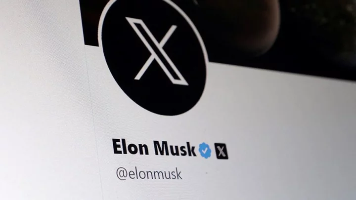
People aren't best pleased with Elon Musk after he changed the Twitter logo to 'X'.
On Sunday, the billionaire said he was looking to change Twitter's logo, tweeting: "And soon we shall bid adieu to the Twitter brand and, gradually, all the birds."
In doing so, he unleashed a wave of criticism, with marketing professor Jean-Pierre Dube telling the BBC he thought it was a joke, asking why anyone would "throw away" such a recognised brand as Twitter's.
Musk is extending the rebrand though, with plans to change the office sign. If the rebrand flops, Musk won't be the first to make a mistake.
Sign up to our free Indy100 weekly newsletter
Indeed, here are some other rebrands that failed to capture the public.
1. Royal Mail
In 2001, UK postal operator Royal Mail decided to change its name to Consignia to stop it being associated solely with sending and receiving parcels. The introduction of the new name alone cost £1.5 million but it went down very badly.
After around a year, the company reverted to its original name. The re-rebranding to Royal Mail reportedly cost the company a further £1 million.
2. Mastercard
In 2016 Mastercard changed its logo and people weren't keen.
So much so that Mastercard later decided to only use this new logo on corporate worldwide communications, and opted to keep their existing brand image.
3. Gap
In 2010, the American clothing retailer Gap changed its logo, causing an immediate social media backlash. This backlash was so intense that Gap reverted to its original logo within just one week.
4. Weight Watchers
In 2019 Weight Watchers renamed itself Wellness and Wellbeing to be more body positive.
The new rebrand didn’t go well, drastically impacting the company’s bottom line, with a stock market earnings of less than half. Following the change, they reported a loss of 600,000 members.
5. Hershey's
In 2009, the sweet chocolate confections company Hershey’s decided to rebrand.
Sadly, their new logo looked like a smoking poo so make of that what you will.
6. Leeds United
In 2018 Leeds United changed its logo and it was so unpopular over 77,000 people signed a petition to boycott the rebrand, causing a PR nightmare.
Call us conservative, but maybe there is a case for keeping things as they are after all...
Have your say in our news democracy. Click the upvote icon at the top of the page to help raise this article through the indy100 rankings.